Visual abstractions
This weeks readings was all about data and the visual presentation of those.
This weeks key learning points:
- Using data to learn about the behavior of the users can be helpful to make desitions, but do not forget that data does normaly not include user experience or the feeling of the user.
- We should define a hypothesis before collecting data.
- Use the right data collection method to do the job
Data
Quantitative- vs qualitative data
There are two different kind of data. Quantitative and qualitative data. Often quantitative data is collected automatically and in huge numeric masses. It tells "what" is happening. For example how many visitors of your website click a certain button.
On the other hand if you want to find out "why" they press the button, you need user interviews or other methods to collect qualitative data.
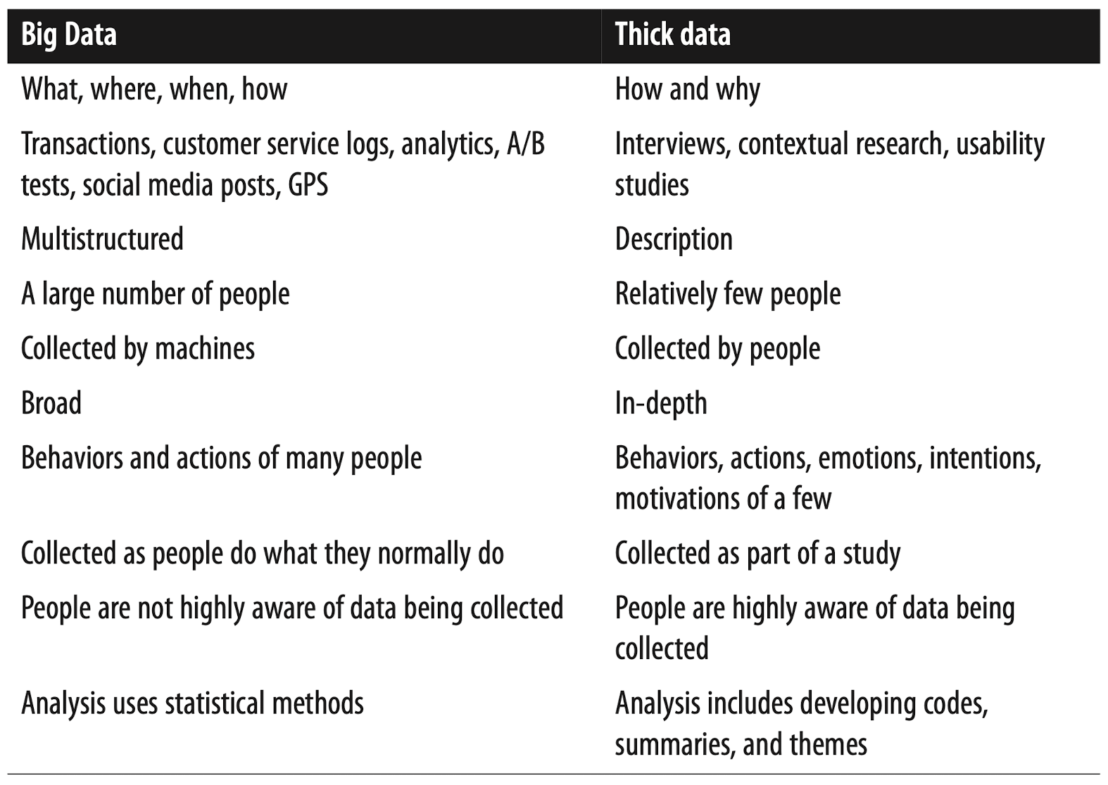
Thick- vs big data
Pamela Pavliscak divided data in thick data[^1] and big data:
Visualization
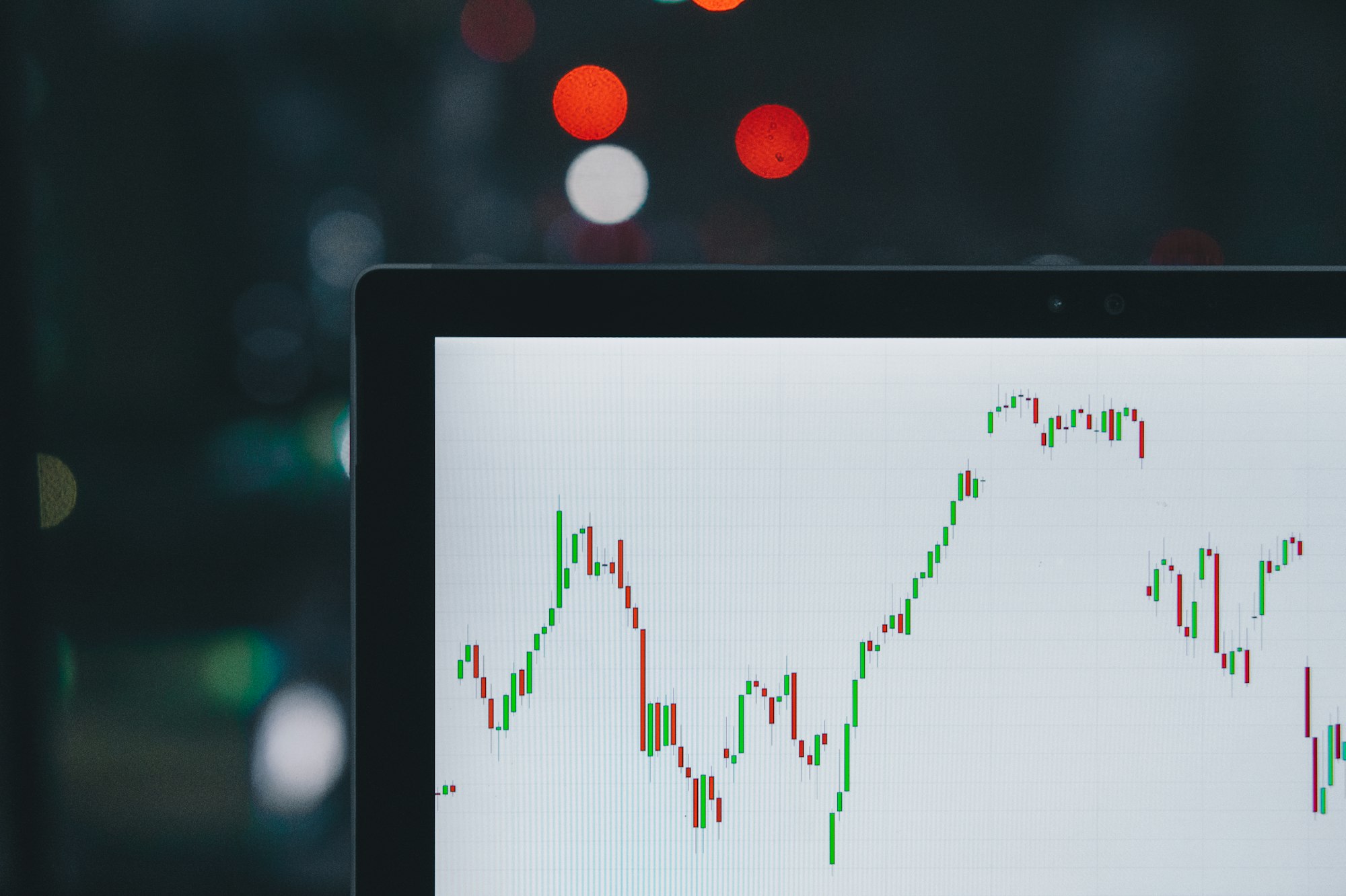
All the data is worthless if you do not analyze and try to understand it. A good way to do this is through visualization.
Visualization can help you regognizing pattern.
Guidelines on how to visualize data
Jacques Bertin divides data in three categories. Nominal, ordinal and quantitative data:
- Nominal: Data like a car brand
- Ordinal: Nominal data but has a ranking, ex. the likert scale (like, like somewhat, neutral, dislike somewhat, dislike)
- Quantitative: Numeric data, ex. age
This data can be marked with areas, points and lines. To make the marks distinguishable, they can be given properties such as position, color, size, shape, gray and texture.
But not every property works for every data type. Color is not a suitable property to read an exact value from a chart, but it's perfect to differentiate car brands.
Readings
[^1] Pavliscak, Pamela. 2015. Data-Informed Product Design. O’Reilly.
Buxton, B. 2007. Sketching User Experiences: Getting the Design Right and the Right Design. Morgan Kaufmann. 76-81.
Eggers William. D., Hamill R., Ali A. 2013. “Data as the new currency. Government’s role in facilitating the exchange”. In Deloitte Review. 13. 18-31.
Fisher, D., DeLine, R., Czerwinski, M., & Drucker, S. 2012. Interactions with big data analytics. In Interactions. 19(3). 50-59.
Mackinlay, J. D. & Winslow, K. Designing Great Visualizations. Study for Tableau Software. (undated, retrieved November 2013).